Plume
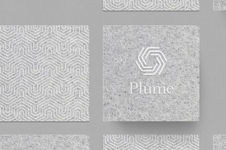
A brand identity system for Plume, and adaptive WiFi product.
The mark picks up on the hexagonal form of the product, using linear forms that reference the universal symbol for WiFi. The word-mark was crafted bespoke to the brand, using bracketed serifs that pick up on the forms within the mark.
Using a warm, neutral color palette, paired with tacticle, unconventional material choices — the visual identity for Plume positions the brand in relation to the home, rather than leading with a story of technological innovation.
Role:
Design Lead (Sr. Designer, Art Director)
Agency:
Character SF
Park National
Client: Park National
Agency: Park National
Category: Branding
Role: Art Direction, Graphic Design, Illustration
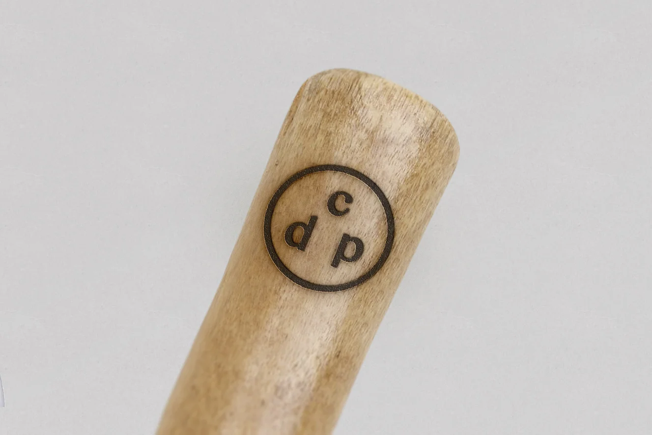
Branding for Park National, a creative agency in Montreal, Canada.
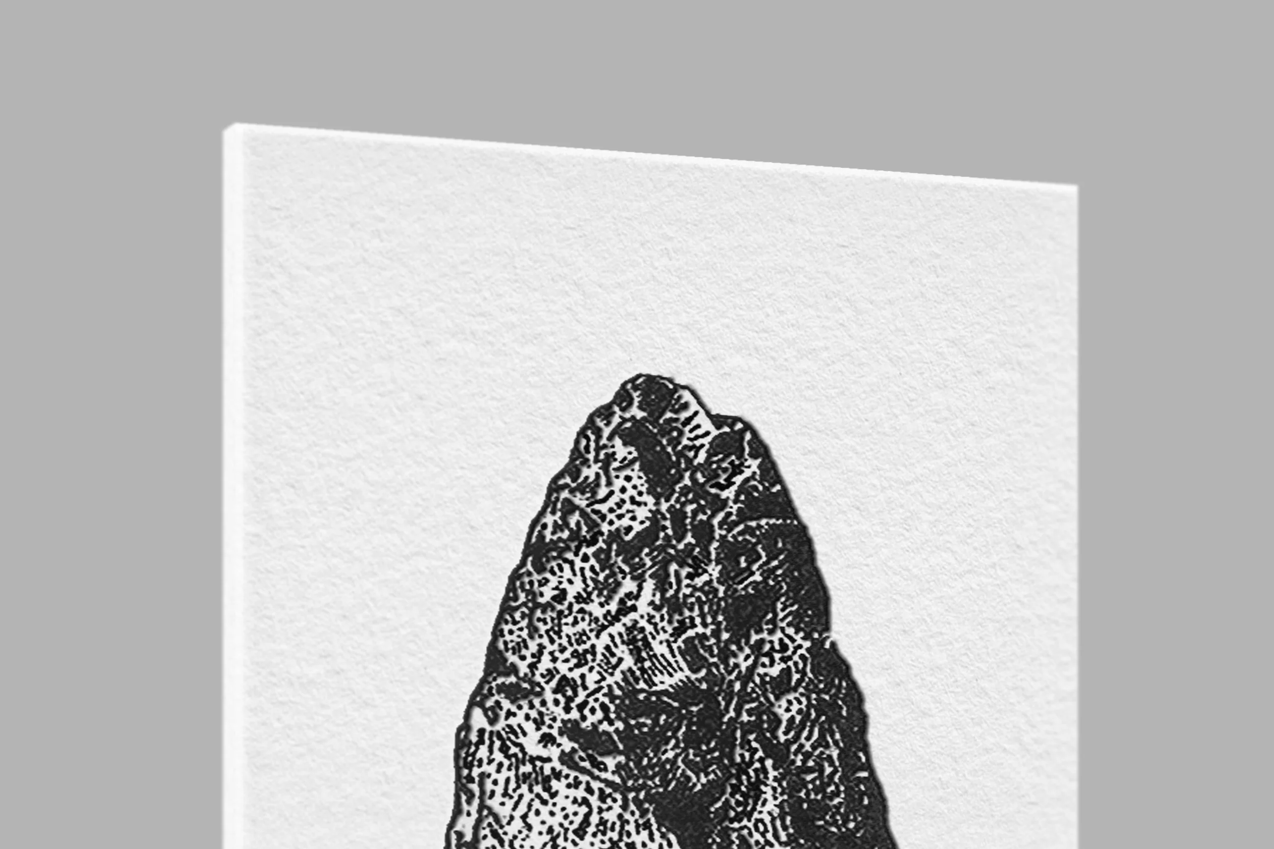
The Acheulean hand-axe—known as the first tool created by early humans is used as Park National's lead signifier. The illustration is bold and complex, telling a story of innovation and applied creativity. Reinforced with a timeless wordmark & monogram, the brand's visual language communicated the agency's thoughtful, thorough, and innovate approach.
Features:
- Aesse Visual Journal
- Logo Design (Art Power Press)
San Francisco Design Week
Agency: Character
Role: Concept & Lead Designer
Photography: Todd Tankersley
We are constantly shaping the world around us. From the buildings we work in to the roads we used to arrive at them, from the tools that we work with to the ways we unwind—nearly everything that surrounds us has been designed. And, as it often should, much of the design amidst us goes unnoticed. So much so, that we rarely consider the stories and process behind them.
These installations are a visual metaphor for reavealing the design process. By pairing complex wooden frameworks with seemingly invisible faces, we wanted to urge the viewers to take a second look at the thoughtfulness and detail in things that generally go unnoticed.
The letterforms were photographed throughout the city and displayed at the festival's Design Hub throughout the festival.
Featured on Fubiz, ItsNiceThat, Collate, and Sex, Drugs & Helvetica.
Fabrica Stationery
Client: Fabrica
Category: Print
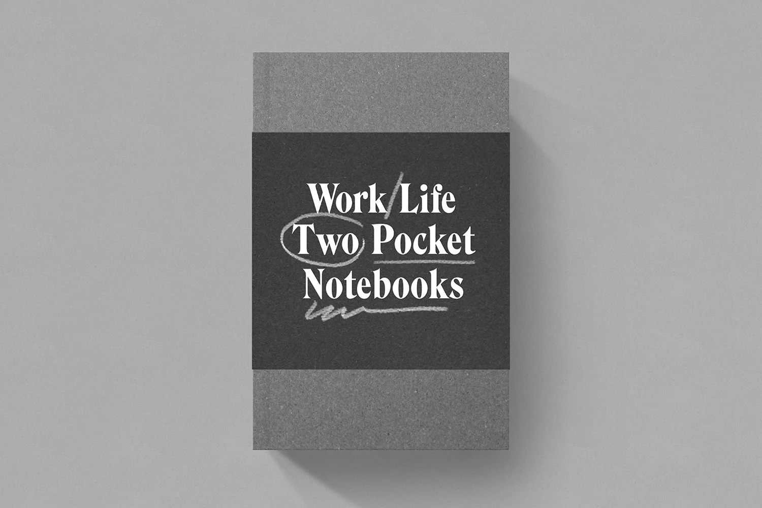
Proposal for Fabrica's 2016-2017 stationery collection, built during a two week trial at Fabrica.
The collection , Work/Life, is a set of notebooks, notecards, and paper goods that come in two subsets — One for life, and one for work. The Work set takes inspiration from the Fabrica campus' cool, neutral tones. The Life set is inspired by the warm, sand and terracotta tones of the city of Treviso.
*Photography used for mock-up are pulled from It's Nice That's feature on Fabrica. Read the full article here.
Citizen Vintage
Client: Citizen Vintage
Category: Branding
Role: Art Director, Producer, Designer
Branding for Citizen Vintage — A small, thoughtfully curated vintage clothing store in Montréal's Mile-End.
When approaching this brand, a classic colour palette & coat of arms were paired with a minimalistic style of execution. By balancing traditionalist content with a contemporary aesthetic, the brand's visual language tells a story of Citizen Vintage's positioning; A thrift shop with a distinctly curated collection of vintage, altered, and custom apparel.
Places Near Home
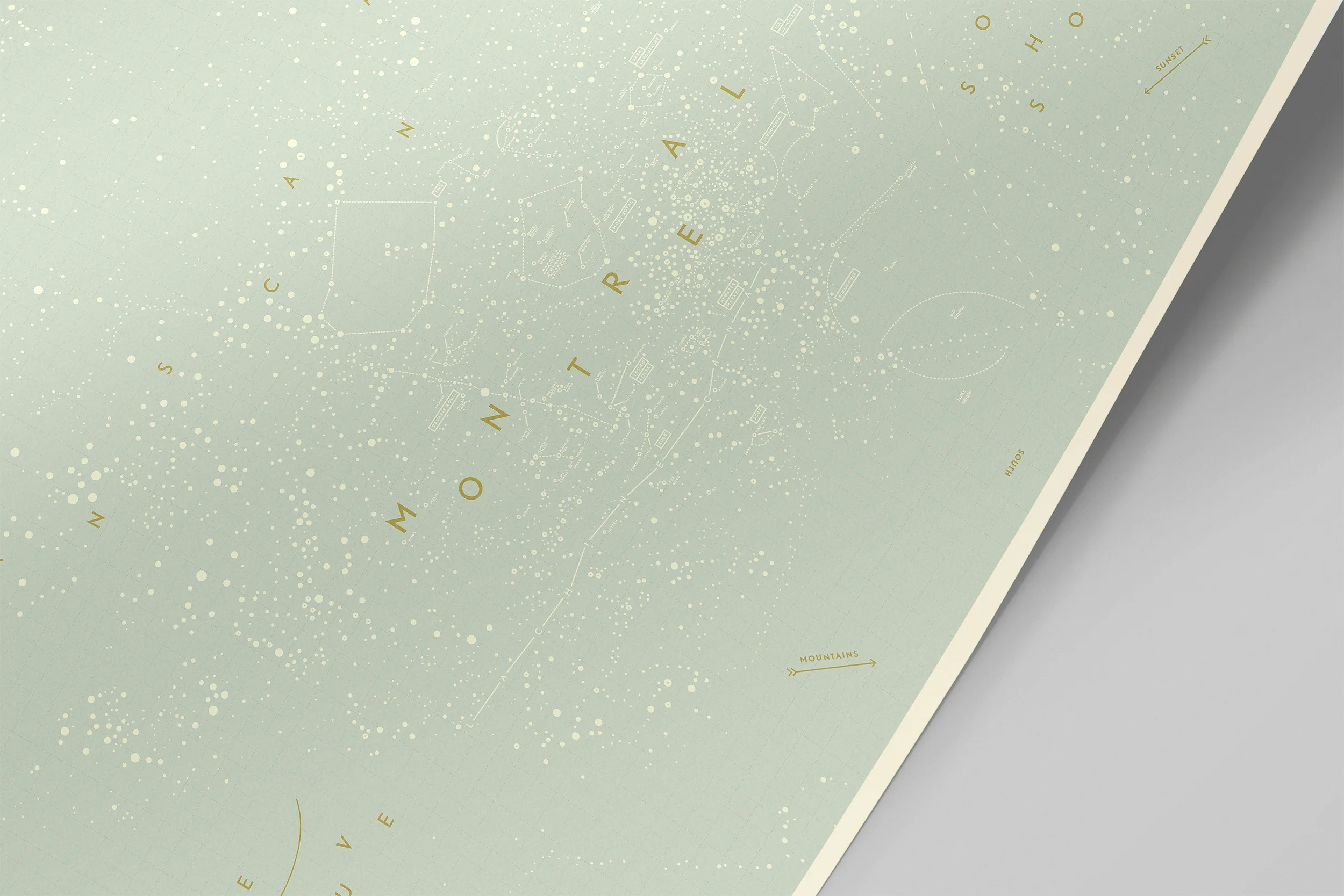
Places Near Home is the first of a series entitled The New Astronomers, that document light patterns in familiar environments. This piece documents the light patterns created by Greater Montreal via satellite imagery; Naming clusters and formations based on their location and personal experiences with them.
Project: Places Near Home
Category: Graphic Design
(Personal)
Nike | Holiday Gift Box
Agency: Character
Client: Nike
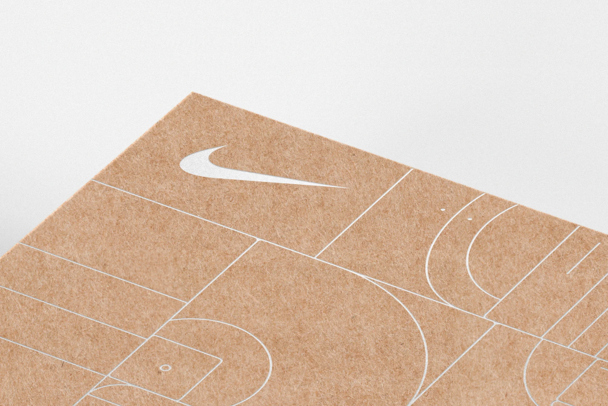
Proposed packaging for Nike Global's online holiday gift packaging. The box box uses a heavy-weight kraft stock, paired with a silver-foil pattern built of various courts & terrains.
Untitled 12
Untitled 12
(Personal Work)
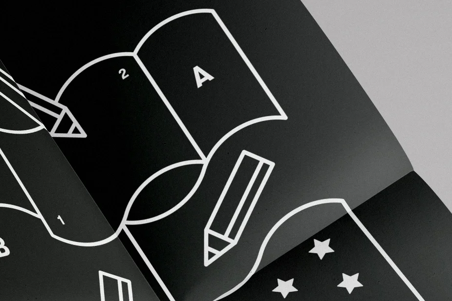
Untitled 12 is an automatic illustration exploring personal references of the roles of colour & symbolism as communicators that are constantly being redefined. The world is a colouring book.
Exhibited at Chromatic (Paris, France).
AIGA | Quotes
AIGA | Quotes on Practice
(Personal Project)
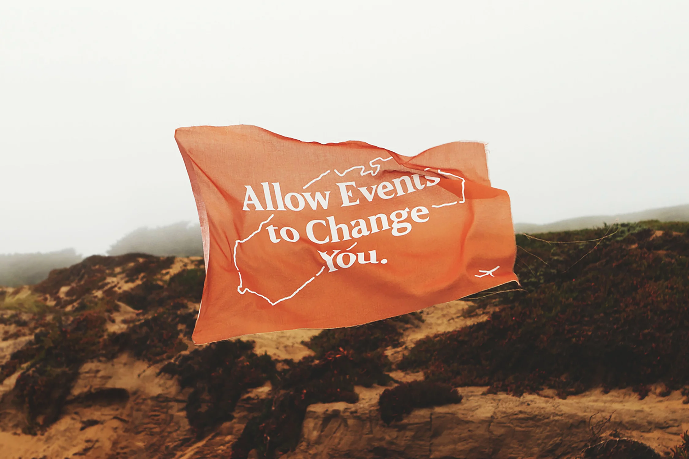
A photographic series of quotes on work & life practices, shot along the coast of Northern California. Wind hunting and thoughtful insights by Natalia & Victor Bivol.
Featured on AIGA's Eye On Design.
She & He
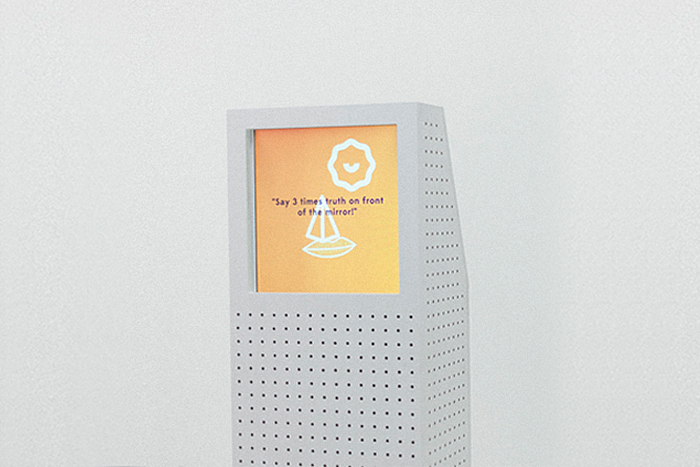
She & He is a collaborative project between Mer/Sea & Iregular. The installation stands as two monoliths that have a circular conversation with one another. She & He use algorithms to pull content from social media feeds, to initiate new topics. The process functions as follows.
Step One — A random word is chosen.
Step Two — She says something found online.
Step Three — He answers something using a relevant line found online.
Step Four — She answers something using a relevant line found online.
Step Five — Process repeats infinitely.
The audience can influence the topic of their next conversation by tweeting a word with the tag #sheandhe.
Project: She & He
Studio: Mer/Sea & Iregular
Category: Interactive Installation
Role: Art Direction, Graphic Design
w/ Gabrielle Matte & Will Vincent
Exhibited at Chromatic, 2014.
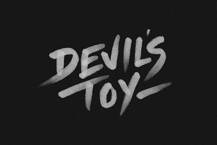
Devil's Toy
Project: The Devil's Toy
Client: National Film Board of Canada
Agency: Deux Huit Huit
Role: Hand Lettering
Hand-illustrated logotype I developed at Deux Huit Huit for The National Film Board's release of The Devil's Toy Redux.
The logotype was later integrated by the Deux Huit Huit team for use in various promotional material, including posters, stickers, and social media assets for the event.
Champs Des Possibles
Project: Le Champs Des Possibles
Client: Les Amis du Champs des Possibles
Category: Branding
Agency: ByeBye Bambi
Art Direction & Design: Michael Mason
Creative Director: Fred Estimbre
Proposed branding for Champs Des Possibles, a lot-converted green space managed by its surrounding community in Mile-End, Montreal. The distressed execution of the storybook-like wordmark and monogram allude to the feeling the community has about the space; unpretentious, rich with history & sacrosanct.
The space is defined by the community, so we thought the brand should be as well. Being a green space, walking tours are regularly given to teach children about the wildlife & flora of the area, so we proposed that we integrate a crayon rubbing excercise into their cirriculum. After a few classes, we would take these patterns and textures developed by the children of the neighbourhood and use them as supporting visuals for the brand - creating a seasonal visual library defined by both the environment and the community that nurtures it.
Anteeo Tea Company
Client: Anteeo Tea Company
Category: Branding
Role: Art Direction, Design
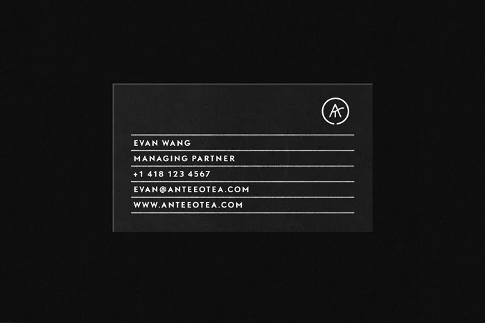
Branding & packaging for Vancouver-based Anteeo Tea Company.
Featured on Wallpaper* & The Dieline.
Chez Latina
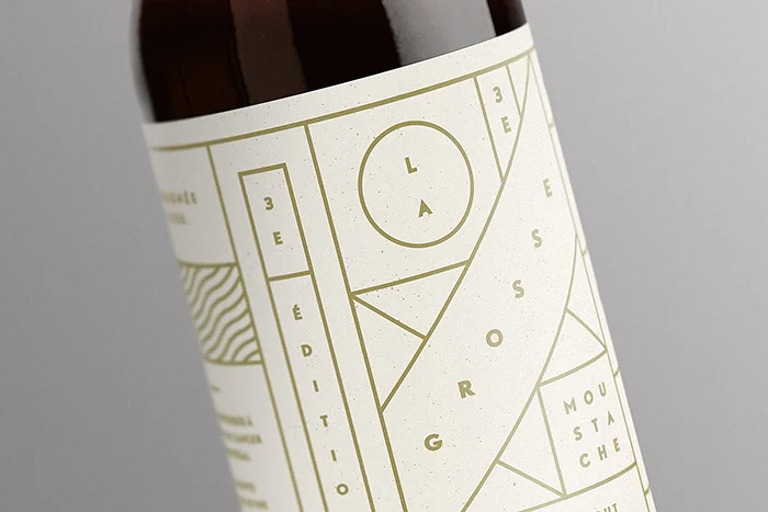
La Grosse Moustache
Client: Chez Latina
Category: Packaging Design
Packaging design for La Grosse Moustache, a limited run of espresso stout produced annually in by Chez Latina, in Montréal, Canada.
Featured on The Dieline & Packaging Design Served.
Fruits & Animals
Promotional poster design for Mer/Sea Collective. The design pushes the duality of the terms (Mer, Sea) by functioning as an ambigram.
Project: Fruits & Animals
Role: Illustration, Graphic Design
(Promotional via Mer/Sea Collective)
Messe Noir
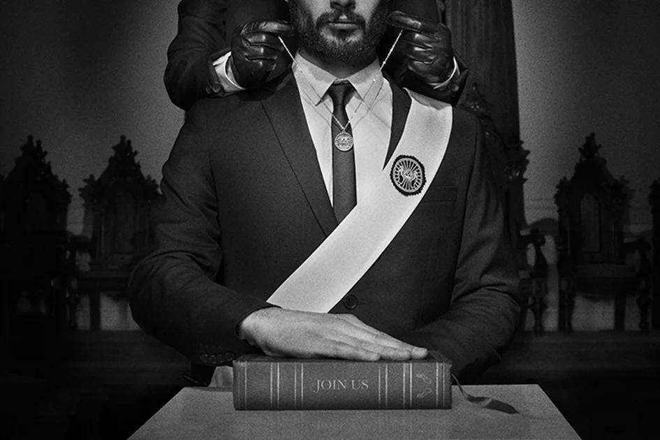
Art Direction and branding work done for Montreal-based band Le Matos and their latest album Join Us. Le Matos is an electro band with a fixation on the occult that also produces soundtracks for various Montreal films within a niche community. The idea was to create a branding that would resemble something that had existed in a long forgotten cult. We created a seal that could be overlayed easily over any imagery resembling old closed captions on documented paranormal films.
Project: Le Matos
Category: Branding
Role: Co-Art Director with Danny Demers
Maison Théatre
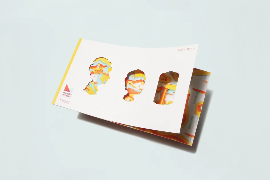
The visual is comprised of triptique of die-cut silhouettes, exposing a larger installation that lives behind the scene. The adult evoking the idea of parenthood and guidance, the child in it's innocence and curiosity, and the theatre in it's entirety as it's watched by both of them.
Project: Maison Théâtre 2014
Agency: ByeBye Bambi
Role: Art Direction, Design & Installation
LIFT
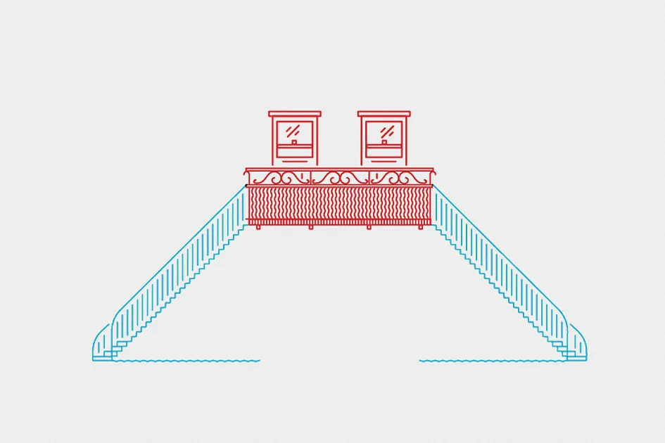
Select illustrations developed at Iregular for LIFT, an interactive installation featured at Place des Arts for Montréal en Lumière, 2013.
Project: LIFT
Studio: Iregular
Category: Illustration (Interactive)
Role: Illustration
TEDxMontreal
Introductory video for the first edition of TEDxMontreal. The film explores the multiplication and joining shapes as a visualization of collaborative thought.
Client: TEDxMontreal
Studio: Une Banane Collective
Category: Video & Installation
Role: Art Director
WeSC
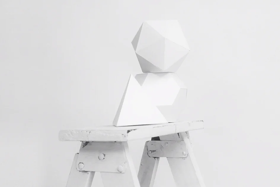
Installation created in store and on display of the window to highlight the launch of the 2012 Spring Collection from WeSC at their flagship store in Montreal.
Client: WeSC
Studio: Une Banane Collective
Category: Campaign, Installation Design
Role: Co-Art Director with Danny Demers & David Oliva